| From Tog on Software Design
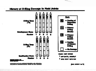
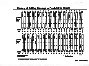
The Challenger: An Information Disaster Belorussian translation: http://webhostinggeeks.com/science/challenger-Exerpt-be Why did the space shuttle Challenger explode? Many people assume it was because of poorly-functioning O rings on the booster rocket. However, those O rings didn’t send that ship up on a cold winter’s morn. People did, and those people drew their most critical information from two simple charts, screened by an overhead projector. The graphs displayed tiny pictures of each shuttle booster, lined up in chronological order, showing launch temperatures and any O ring damage.
They looked like so many crayons in a box, and when the engineers and managers finished looking at them, they didn’t know any more than they had before. The launch was made and seven people died.
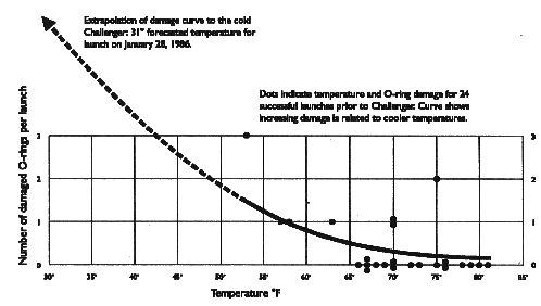
Lets look at the information the Challenger engineers looked at but could not see reorganized by one of the world’s foremost experts on envisioning information, Edward Tufte:
This is the same information, presented in a form that even a child could understand. Poorly constructed overhead slides don’t normally kill people, but they do often leave people in the dark. Tufte, author of the seminal works, The Visual Design of Quantitative Information, and Envisioning Information, demonstrates time and time again how careful design of information can communicate in a single glance information that might takes hours or weeks of effort to ferret out in its raw form. Just as important as new, clean software design in the coming decade will be designs that result in equally clear information. Update: Placing blame where blame is dueIt was not the Morton Thiokol engineers who made the decision to go ahead with the ill-fated launch. It was NASA. The engineers, meeting in Utah, communicated two messages from their meeting to their local managers. First, they produced the a formal, abstract result: "With the data available to them, and with NASA knowing as well as they that the design was flawed and that temperature might be a causal factor, the engineers argued that the Challenger ought not to fly so far out of the field database, the firmest evidence available." --Robison, et. al.* That's not all. They also communicated verbally and vocally to their managers that it was extremely unsafe to launch under the expected condition. Two of the engineers became really hot about it, with one of them pounding the table with his fists. That more important message never got transmitted to Florida. NASA, hot to trot, was able to rationalize that the formal message from the engineers in Utah was that they really didn't know. Robison, et. al., also argue that the engineers did not have the full data available to them that Tufte had. Their paper, while shifting the full extent of the blame away from the engineers in the room that morning, does little to change the shuttle disaster away from incompetence as its cause. Instead, one would want to know why those engineers did not have all the necessary information available to them, specifically air and o-ring temperatures coorelated with o-ring damage. It was well-known that this o-ring material lost its effectiveness with cold. Then, there's the matter of the slides. The cute rocket-ship slides, with their ordering by chronology rather than level-of-damage, remain a particularly egregious example of information presentation. If the author of those slides had attempted to correlate temperature and o-ring damage, as did Tufte, he or she would have realized that information was missing--and maybe even gone and found it--long before the fateful meeting. Would that have been the only slide so produced? Probably not. There would be other factors one might want to correlate, but, given the information known about cold and o-ring material, temperature certainly should have been one of them. If the Utah engineers had passed along Tufte's slide, it would have saved the astronauts. That slide, as it was transferred from manager to manager, would have eliminated all doubt in each of their minds, precluding the eventual rationalization, and those seven people would be alive today. Their recommendation, as well, would have shifted, had they seen that slide, from "out of the field database" to "you will kill everyone aboard." Note: These charts were graciously given to me by Edward Tufte and appear in his book, Visual Explanations: Images and Quantities, Evidence and Narrative. * "Representation and Misrepresentation: Tufte and the Morton Thiokol Engineers on the Challenger," Wade Robison, et. al. |
|
Don't miss the next action-packed column! Receive a brief notice when new columns are posted by sending a blank email to asktoglist-subscribe@yahoogroups.com. |
| Contact Us: Bruce Tognazzini Copyright Bruce Tognazzini. All Rights Reserved |