 |
||||||||||
| ||||||||||
| ||||||||||||||||||||||
NN/g Home ![]() AskTog
AskTog ![]() Interaction Design Section
Interaction Design Section ![]() Top 10 Reasons to Not Shop On Line
Top 10 Reasons to Not Shop On Line
AskTog, January, 2004
We'll be running into a few D'ohLTs in this column. A D'ohLT is a person who screws up some product or service so badly that, when you attempt to use it, you end up slapping your head and yelling that famous homersimpsonian cry, "D'oh!"
D'ohLT rhymes with "jolt," and is, of course, not to be confused with any similar sounding, but possibly actionable word.
With all the hype at the coming of web commerce, web sales still pale in comparison to bricks-and-mortar, and for good reason. Commercial websites are still, in the main, scary, difficult, and undependable.
Responsibility for many e-commerce problems lies with designers. Responsibility for others lies with engineers, marketers, managers, and executives who are willing to accept mediocrity or worse.
I’m confident these companies' sales outcomes reflect the poor quality of their sites. I’m amazed that their sales divisions continue to put up with it, but perhaps, with so many bad examples out there, they think their companies are doing the best they can. They aren't.
You will find some specific examples below. These sites are not unusually bad. They are, rather, all too average. I came upon them not because I was looking for deficiencies, but because they had products or services I was personally interested in. They are, in fact, good companies with good products. They just have badly designed or implemented websites.
Many sites have too many objects, too intense use of graphics, and make too poor use of consolidation techniques.
Not everyone has a 10 gbps connection with near-zero latency. In the real world, many people are still using connections speeds below 28.8 kbps. These people are called "paying customers." They do want to see the merchandise up close and personal, and recognize that loading those useful images can take time, but they don’t want that other 400k of cutesy graphics surrounding the merchandise.
Set a graphics budget, exclusive of product photos and drawings, for each page, keep it low, and stick to it. Then use compact photos or drawings of the products, and make them clickable so people can access slow, but really detailed larger views. (Many sites compromise by having a single image that is larger than necessary to draw the user's interest, but too small to allow them to examine the product.) Test your product using a 28.8k modem. Otherwise, you'll never know why your sales are faltering.
Other people have paradoxical connections that are fast and slow at the same time. My wife and I have theoretically high-speed connections, but via satellite. We suffer a 88,000 mile latency hit for each and every object. Scatter tiny objects all over the page like sprinkles on a cake, and it'll take us forever to download. Objects should be combined into a few large images, then sliced to limit latency. HTML 101.
Few without at least a private T1 connection appreciate your marvelous Flash work that takes 15 minutes to download and exists only to make the site look pretty. Kill it unless you are using it to demo the product and the user has specifically chosen to view it. (The exception is to this rule is if you are selling something like Coke or ShardsO’Glass Freeze Pops. In these cases, the products are so well-known that the site is only about image anyway.
Finally, if your site has won a web graphics design award, you are likely in serious need of a redesign. You are likely featuring something useless but pretty or you wouldn’t have won it. Your job is to move product, not to win awards. Useless but pretty not only slows up transfer, it dazzles the customer and draws him or her away from an appreciation of the product you're in business to sell. Sales 101.
Reason 9: Stupid "cry wolf" promotional efforts make a site and, by extension, the company appear dim witted.
The folks at Google, God bless them, make their money from the labelled sponsored links and little square ads along side the listings, instead of selling secret, top-ranking places that look just like legitimate listings, as do their competitors. The problem is that a few of their D'ohLT clients are spoiling it for the rest of them.
I was shopping for a Canon CP-300 printer and was quite happy when a series of these little boxes appeared suggesting these were sites that would list all the different websites carrying the product, along with the sites' reputations and lowest price.
I clicked on the first one, and it became clear this site had no idea who Canon is or what a CP-300 is. It was one of those moronic ads that just parrots whatever you typed in without any recognition of its actual content. Clicking on it brings you to a puff page where it tells you how wonderful the site is and invites you to spend the next 15 minutes wandering it to find out if they even cover the Canon CP-300. Ever in your service, instead of bailing out, I actually did spend those 15 minutes. They had never even heard of the printer.
I won't be visiting them again, nor any other Google sponsors, until Google straightens this problem out by setting some kind of standards. It’s not fair to their other clients to let these D’ohLTs join in. Presumably, Google gets paid on click-through, and letting these D'ohLTs sit at the table is affecting click-through rates and actually lowering Google's revenues by driving people like me away.
a. Insufficient information
If you go into a bricks and mortar store, you have at least three sources of information:
Websites need not provide the same hierarchy of sources, but they must provide the same quality and completeness of information.
They need to provide extensive details on the merchandise, along with comparison information.
They also need to provide information on how the product might work in the perspective buyer's application, the kind of information normally gleaned from an experienced salesperson. Many retail sites cover this need this by encouraging customers to write reviews.
Some retailers further back up their web-based information with live chat or even phone service. Others provide less information than may be found on the outside of the box, then wonder why their sales suck.
Going to the Source
When the price is great, but the information is lacking, the court of last resort becomes, naturally enough, the manufacturer. The manufacturer must provide extensive, detailed information on every product they sell.
Canon USA currently acts as a wonderful example of many of these top ten faults, including their use of almost as many teeny little graphic elements per page as I have on my entire site. Particular among their faults is Canon's consistent effort to limit information useful to consumers.
I had only two questions about the aforementioned CP-300 printer, designed to connect directly to digital cameras. One was whether, when using it slaved to the camera, the user could crop or trim the photo before printing, and the other was whether it could also connect directly to a computer. (Their TV ad seemed to imply it couldn't.)
At the time I was shopping for the printer, December of 2003, almost no useful information at all was available on the Canon website about this printer. What took its place was a lot of marketing puffery. Over in the corner one page, I did finally notice a button which downloads a dreaded PDF file, claiming to explain the product in detail. (I didn't even noticed this button the first two times I visited the site, and I was looking carefully. It's hard to imagine all those test users were able to find it... Oh, there weren't any test users?)
I pressed the PDF download button, went to dinner in a foreign country, and returned to find the file almost completely downloaded. (It was one of the faster PDF files.) It turned out to be even more marketing hype, with lots of pretty pictures of people picnicking on the beach, although it did reveal that the printer could be connected to a computer.
As far as I could tell, Canon was keeping a dark secret whether this printer is practical to use with a camera, since the ability to crop or trim a photo is vital to any but the most amateur of photographers and that information was absent from the site.*
Some time in early 2004, they did increase the amount of information available on the printer, about the same time as all their dealers likewise had more information. (It is still sparse, but at least it does answer such questions as to whether you can use it with a computer.) The most critical time for this informationt to be available, however, is just as a product is being released.
Canon USA's website, which I visit from time to time, being a Canon person, has appeared to be dominated by marketing D’ohLTs for years. Their optimistic blurbs uniformly fail to provide the necessary information to make a buying decision. Given that the manufacturer is the last resort, Canon’s website, with its empty puffery, has got to be selling a lot of Nikons.
b. Unintelligible information
Let’s look at how two sites display the same information. Here’s how Travelocity shows flights on Delta from Miami to Ixtapa, Mexico:
Join my intensive (and fun!) lecture/ workshop course. Sign up now!Interaction Design course: Go from zero to interaction designer in just three days. User Experience Conference Website There's more than my course at an NN/g conference. You'll find a breadth of other specialized courses and networking opportunities that will put you and your company at the leading edge of the design curve. |
|
|
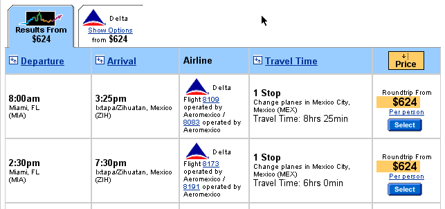
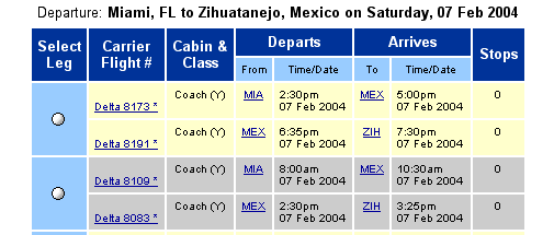
Not only that, they've left out important information, like Travel Time. See how long it takes you to compute travel times on your own. Don't forget to consider that three different time zones are involved. Which three? Beats me. Then, think about looking at a screen with, not two flights, but ten flights.
Please also note that Travelocity lists the flights in chronological order, while Delta lists the flights in order of, um, something.
Most importantly, note that Delta is keeping the price a secret, an approach I’ve seen repeated by other carriers, such as American Airlines. Since every survey on air travel consistently shows that price is the most important criterion to consumers, why do they think that hiding it is a good idea?
The only reason I can possibly see for Delta presenting data in this 1960's print-out format is that no one associated with the website has ever visited a competing site, such as Travelocity, so they just don't know how it should be done. As I always say, when it comes to designing your site, "plagiarize, let no one else's work evade your eyes!"
(OK, OK, actually Tom Lehrer said it.)
Progress is not made by everyone reinventing the wheel. It is made by people noticing Charlie's wheel and adding a greased axle, and so forth. If your design team is not doing competitive analysis, your company will be left behind.
c. Downright wrong information
Legitimate sites don't purposely provide incorrect information. However, many of them provide either no feedback loop to allow users to report errors, or they make the feedback so difficult to deliver that most people won't bother. As a result, errors can persist indefinitely.
There are still a lot of websites with 1960s-era search engines. How many millions is your company willing to throw away because your search engine is telling customers that products you’ve got stacked up to the ceiling don’t even exist? Yes, it’s 1960s engineers that are delivering these wounded birds, but it’s sales, marketing, and upper management that are accepting them.
Under these kinds of primitive search systems:
a) Misspellings are to be punished.
B&H Photo Video Pro Audio is one of many examples of companies suffering from poor quality search facilities. Searches must be exact, or they don’t want to sell to you.
If you want a Lowepro 100 AW, you better know that their system has a space between the 100 and the AW. Otherwise, search will tell you there is no such product. Competing camera stores are just as exacting, except that they demand that there not be a space in the middle.
How many customers know to keep trying various combinations of characters and spacing until one magically works? Answer: not many. If the store says “no matches,” they believe the answer is “no matches.” They just go elsewhere.
b) “OR” searches instead of “AND”
This is another favorite. The more you try to limit the search, the broader it becomes. The world voted on “AND” as a default about a decade ago. Get it together!
a) “Just click the missing object”
If you happen to use anything but the latest Microsoft browser on the latest Microsoft operating system, there’s a fair chance you’ll be unable to complete a purchase at many sites. For example, there’s some shopping system supplier that has invisible “Buy” buttons when Macintosh users try to hand over their dough, even using the latest Internet Explorer.
True, most people have Microsoft systems, but not everybody does, and the color of several million Mac-user and Linux-user credit cards are the same as those of Windows users.
The purveyor of this popular shopping system is clearly at fault for not testing its system properly, but what of their many victims, the retail websites that are losing millions because of it? No matter what kind of outsourcing you may do, you need to have an active program to verify the outside party is doing their job.
(Please, don't bother writing to tell me that my own website looks weird on your obscure browser. I'm not a retailer, and I'm spending just exactly as many hours on this free site as I have available. Do as I say, not as I do.)
b) “Just pick up the phone and call the 800 number”
American Express is apparently unaware that e-commerce is done with a computer, not a phone. Pick out the premiere hotel you want on their website, arrive at what should be the ordering page, and it will only tell you to pick up the phone and call them to make the reservation.
I spent 45 minutes getting to the hotel pages, then had to wait in the queue at the 800 number anyway. Why 45 minutes? I had to:
The final insult? The hotel the website sold me on closed about a year ago. The people on the phone knew that, but apparently the D’ohLTs who run the website don’t. I found a different hotel through a different service. I won’t be using American Express again except by phone, a service that works quite well.
You’ve spent an hour in the supermarket, carefully selecting all the items your family will need for the next three weeks. Now, you’re headed for the checkout counter, a job well done. But wait! The power just went out for 2 seconds! Oh, no! All your food is back out of the cart and on the shelves again!
That’s the experience B&H offers their customers. When my browser crashed, they pulled everything from my shopping cart, forcing me to start all over.
Guess what? Many people won’t start over. I once turned my back on over $500 worth of DVDs after such an experience. Can your company afford to take those kinds of losses, just so your programmers don’t have to go the extra step to protect the user’s information?
The worst site in this regard probably on the planet is TicketMaster, which purposefully pulls the plug after as little as one minute during a ticket transaction if you don't type fast enough. (They generously give you three minutes on the page where you enter all your personal information, including name, address, phone, the junior high your mom attended, etc.)
Take too long and TicketMaster drops the tickets you were about to purchase back into the pool for customers who are either younger, not disabled, or don't feel compelled to read the fine print—or even the large print for that matter. When they do so, they throw away all the information you've already entered, expecting you to type it all again, and again. If you're over 20, you are much better off calling on the phone, even if it does cost them much more to handle such sales.
In buying one set of tickets, I selected the tickets seven times before I was able to complete a transaction, but then, I only type 40 words per minute. Their motive is understandable, even if their embodiment is Draconian: They don't want someone else to be turned away while grandpa spends an hour deciding he's really no longer into heavy metal. Grandpa should, however, be allowed more than two minutes to discover whether the tickets are behind a post 1/4 mile from the stage.
Interestingly, the first set of "best available" tickets I was offered were in row 16. Then, they jumped to row 22. They moved around in row 22 through the next five attempts. On the last attempt, more than a half hour later, I was offered once again the original tickets on row 16. My only explanation is that most users keep getting kicked off the system, so that those tickets had been offered over and over again, finally returning once more to me. I typed really fast that time.
TicketMaster needs to look at their logs and figure out what percentage of users are getting kicked off the system, and what percentage of those never come back.
Other companies throw business out the window in the name of security. If I've left something in the shopping cart for perhaps 30 minutes, that is apparently akin to leaving a bank vault open for 30 minutes with a "free samples!" sign. These companies then deliver a completely incomprehensible systems-level error message and dump people out of their site. Funny, amazon.com seems to be able to let me leave things in my cart almost indefinitely without these security measures. What do they know that these D'ohLTs don't?
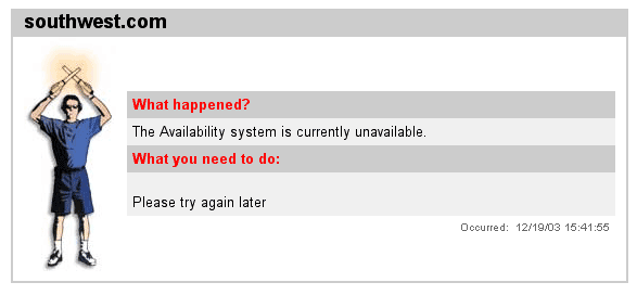
Southwest Airlines, a beautifully-designed site, seems to have hired some engineer-to-English translators to work on their site, a bold move that certainly bucks conventional D'ohLT wisdom. Check out their message when they bounce you out of the system. It tells you not only what's wrong, but what do to about it:
Of course, there's always room for improvement.
A few particularly ham-handed sites let you know in front that they apparently don’t want your business.
Dell has been spending millions of dollars trying to get people to come to their site to buy cameras, printers, and other assorted non-computer “accessories.” When people get there, however, they learn that, while Dell wants your money, they’re in no particular hurry to get your merchandise to you.
In fact, they let you know, in the case of each of the items I explored, that it will take “5 to 7 days to ship.” That’s just to ship! And these are items apparently in stock! Of course, you can pay a high premium for overnight delivery, just so you can get your camera or printer in 6 to 8 days. Not likely.
I like Dell computers, I’ve bought three of them in the last three years, but I won’t be buying anything other than computers until they learn how to compete in shipping their products.
The worst part of all this is that the disclaimer may not even be true. Dell may normally ship in a day or so—I certainly received my computers before promised. If it is the case that some anxious person—a lawyer perhaps?—decided they must label everything with the worst case, instead of putting in a real-time inventory tracker report, that decision is costing the company millions.
In 1960, I worked at Bank of America on the ERMA project. ERMA was the world’s first electronic check processing computer. It had core memory—ferrite beads suspended from wires—and vacuum tubes. The memory was infinitesimal—less than that of the original Apple One, and the speed was hundreds of times slower. Programmers in those days did not throw away bits or clock cycles. Both were precious commodities.
Guess what? It’s now a different century! Computers have what can only be described as gobs of memory, along with blinding speed, speed so extreme that only the finest operating system developers in the world can bring them to a crawl.
So why can’t I input my credit card number the way it appears on the card? Why do I have to suck the extra spaces out, making it all but impossible to re-scan it for errors? We’re talking three spaces here, three bytes. We’re talking a loop to scan for those characters that can be accomplished in couple of microseconds.
What possible reason exists today for writing third-rate code that was no longer acceptable by the late 1970s? How much money is your company willing to lose to put up with it? When are you going to demand that people be able to enter dates in the way they are most comfortable, enter credit card numbers in the way they are most comfortable, and enter social security numbers with the hyphens as either God or Roosevelt intended?
And speaking of dates, why does the program default to a date in the distant past, instead of today's date? And, when making a hotel reservation and I've entered a date a week from now, why does the program then guess that I'll probably, therefore, want to check out a year and a half ago? Sloppy, sloppy, sloppy, as is giving me a type-in box smaller than that which you want me to type in.
Travelocity, my favorite travel site, emails out weird e-tickets. You know that six-character record locator code that all the airlines live by? It's not on there, as far as I can tell, and I've looked really, really carefully. Instead, there is all kinds of extraneous text having nothing to do with my getting from Florida to New York (a problem not limited to Travelocity). The reason I was on the Delta site lambasted earlier was so I could actually make the purchase from them and get a proper e-ticket after using Travelocity's excellent facilities to make my choice.
Amercian Airlines does give you all the information, but their e-tickets. print out weirdly, with each frame (!) on a separate page, so you end up with this wad of paper with lots and lots of white space, in lieu of a single sheet of paper. What's an e-ticket doing with frames, anyway? This has been going on for years, apparently unnoticed.
An example of this one is PayPal. They claim a buyer guarantee, and, when you try to pay with a credit card, flaunt the guarantee and tell you that, if you don't use the card, they'll enter you in a contest you're most unlikely to win.
I recently used my card, and I won a much more important contest. I received fraudulent, unusable goods on an ebay auction. It turned out PayPal won't actually pay out unless you receive absolutely nothing from the seller. Even an empty envelope gets PayPal off the hook. Only because my credit card backed me up was I able to retrieve my money.
Corporations and their lawyers depend on the fact that we won't be reading the fine print on the myriad forms we click "agree" to every day to maintain the upper hand. The courts, peopled by the same lawyers who, wearing their politician hats, have voted in these corporate protections, like to pretend that everyone a) has a law degree and b) has nothing better to do than interpret a 20 page document viewed through a postage-stamp window.
It's a buyer-beware e-world, making bricks-and-mortor stores, where you can touch, feel, and plug in the merchandise before buying, much more attractive. Offering limited protection, then trying to talk people out of the real protection of a credit card sale, is par for the on-line course.
Until the on-line retail community addresses all these issues, the real e-commerce revolution will continue to be on hold.
* Canon digital camera viewfinders, both digital and optical, typically don’t accurately display the exact picture you will take, sometimes showing as little as 80% of the end result. Unless you can crop, you are guessing at the picture you will end up printing.
I am happy to report that I later learned you can, in fact, crop a photo in the camera, no thanks to Canon's website. (back)
Have a comment about this article? Send a message to Tog.
Previous AskTog Columns >
|
Don't miss the next action-packed column! Receive a brief notice when new columns are posted by sending a blank email to asktoglist-subscribe@yahoogroups.com. |
| Contact Us: Bruce Tognazzini Copyright Bruce Tognazzini. All Rights Reserved |