 |
||||||||||
| ||||||||||
| ||||||||||||||||||||||||
AskTog, July 2010
[The "New" Google News referred to in this article came out in June, 2010. It was dreadful. They have since, as the altered title of this article suggests, backed off on many of its worse features. The continue to play with its design. However, they seem to have learned a lesson that many of us learned long before 2010: If you want to make radical changes that are no better or actually worse than the original, you had better provide a mechanism that will enable people to either revert to the original or modify the new to work much like the old.
Subsequent to the original publication of this article, Google began to silently back away from its most egregious errors in the New Google News.
The team involved appears unwilling or unable to just come clean with the fact that they screwed up completely, and, instead, just chipped away at one individual screw-up after the other. It's as though they had started out by replacing their prize gazelle with a pig and were now carving away at the pig, desperatly trying to make it look as much like a gazelle as they can, as long as they can still use the pig. So far the result, unfortunately, does not look (or feel) like a gazelle at all, but only like a distressed and wounded pig.
As their reversions continued to occur, I continued to insert revisions in the text, set off with brackets, and slowly counted down the Top 10 clock in the title. My last time through was in 2013-01. What follows is my original introduction.]
In my thirty plus years as a human-computer-interaction designer, I have never seen a company take as successful a product as Google News and totally trash the interface the way Google has done. I have seen a beverage company do it, though.
In 1983, Coca-Cola shot itself not in the foot, but in the head by bringing out “New Coke,” a reformulation of Coca-Cola that had already been shown in focus groups to cause severe alienation and anger. Their bull-headed CEO shipped it anyway, and the result was a disaster. The original formulation, now dubbed “Coke Classic,” reappeared less than three months later.
On July 1, 2010, Google gutted their news aggregation service. As with New Coke, tests over prior months had revealed that many people didn't simply dislike the new layout and behavior, they hated it. Their comments have been venomous even by web standards. (See Mo J's recent comment, no more venomous than others, but far more amusing.) It appears there are some bull-headed managers at Google that just don't give a damn.
For long-term Google readers, there's no real alternative. Bing news is nothing but a sea of headlines with no context and news.ask.com is an empty promise: It looks very much like Google news did but is heavily biased toward a handful of television-news perveyors—CNN, ABC News, CBS News, etc., who will likely give you a single paragraph of news plus a long, drawn-out, unenlightening video clip.
The race is now on: Will Google come to its senses before ask.com, the Royal Crown Cola of the news wars, wakes up, makes their website even more like the Google original, adds real news sources, then publicises the fact? Or Bing, the Pepsi of the news wars, decides to get serious and hires an HCI designer and a newspaper journalist and gets down to business?
What follows are the top ten reasons Google’s New Coke News sucks. To set the before and after in your mind, visit news.ask.com to get a good idea of the before and Google’s New Coke News to see the after.
Six months ago, before Google started tinkering, Google News consisted almost entirely of well-ordered, desired and desirable information. At most, there was about 10% noise. Now, it is neatly divided, with well-organized, desired and desirable news on the left, while the right-hand column is taken up with randomly-ordered agglomerations and fluff. While a few people may find a few items of interest, most will not.
Information Theory divides the world into signal and noise. Anything a user does not want or need to see is noise, and noise is the enemy of signal, i. e., information. Google has cut the usefulness and usability of Google News almost in half.
Given that the right column is predominantly noise, we are left with only one news column in an era when Google should have, if anything, been moving to three or more, dependent on monitor size and the user's choice of page width.
[You can now return to a true two-column layout. To get rid of the extraneous right column, click the well-disguised "get rid of the extraneous" button. It is a square button featuring a pair of chevrons [>>] at the extreme right corner of the Top News bar. (Clicking the now-altered button [<<] makes the extraneous column reappear.) Next, drop down below the Top News to the next bar which reads, "News for You - Edit" Don't edit, just let your eyes wander to the far right of the bar where you'll find the subsequently-added View As settings. Click the Two Column option and Google News will be as of yore.]
I have yet to see a single study that would suggest that scrolling is anything more than a necessary evil. The more scrolling involved, the more evil. By moving from two columns to one, Google has neatly doubled the amount of scrolling necessary to see all the actual news. Because of this scrolling issue alone, it takes twice the physical effort and twice the Fitts' Law targets to read the New Coke News as the original, twice the clicking, twice the dragging, twice the RSI. Then, there's the frustration of having to look at twice as many screenfulls of noise-ridden information to see the same amount of news.
Google is also continuing to squander the most valuable real estate in any newspaper—the space “above the fold.” In the case of a physical newspaper, the space above the fold, the area of the front page that can be seen when the paper is folded in half and slipped into a machine or stacked on the floor or shelf of a news stand is considered the most important space in the paper. On a website, “above the fold” is that area a given user can see on his or her device without scrolling. Google has squandered that area for some time with extraneous elements, and this edition does nothing to address that.
Ironically, I actually agree with Google's decision to suddenly and irreversibly switch their readers to the New Coke News. If you are going to seriously degrade your website like this, you better shove the new site down people's throats, or they just simply won't switch.
Google must be hoping that maybe, after a while, people will get used to the new way and stop complaining. This was the philosophy behind New Coke and it worked for them. Well, for almost three months it worked for them. Sort of.
You need to take a very different approach, however, if you want to transition people to a website design that is actually better than your current one. Charles Schwab was one of the first sites that figured this out, and their method is excellent:
Step one is to complete the new site all the way through alpha, beta, to release. Even then, you don't release it exactly. What you do in step two is, instead, to put a link in a prominent place on your existing site that says something like, “To try our new site, click here.” Early adopters will flood the new site, learning all the new features and urging their friends to transition as well. Then, you watch your log files.
Only after a lot of people are happily using your new site do you move to step three, pointing everyone to your new home page, instead of the old. Even then, ensure you have a prominent link on your new site that allows users to jump back to the old (“If you're more comfortable with...”). You then continue to monitor which site people are using and ultimately, in step four, shut down the old site and complete the transition.
This method has several advantages: First, users are like cats; they always want to be on the other side of the door. Leave the door open, and they're actually more likely to stay on new side just knowing they could escape back to the old. (Again, this only works if your new site doesn't suck.)
Second, the stragglers, in many cases, will now have peer-to-peer counseling available because you trained legions of early adopters who are now your (free) evangelists and software trainers.
Finally, if no one stays on the new site, you've received the strongest feedback possible that it sucks, so you can take appropriate action before you start losing a large percentage of your customers.
[Less than a week after New Coke News's release, number 7 was rolled-back to its original, always-open behavior and appearance.]
In an apparent effort to make using New Coke News a little less onerous, given its single-column layout, Google has shortened the total column length by tossing out about 20% of the most vital information.
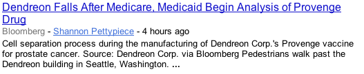
When you looked at a news item in the original Google News, you saw a headline and first paragraph of the featured article along with the headlines of two or three additional articles from competing publications, followed by a listing of even more competing publications, and, finally, a link to, “all 14,614 articles.”
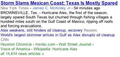
The extra two headlines serve two purposes. First, you're offered a couple of alternate articles. Second, they give you insight as to the nature of this particular pile of news the Google computer has aggregated: This pile isn't limited or focussed on a storm called Alex, it pertains to the BP oil spill.
Looking at the New Coke News, you'll instead see something like this:
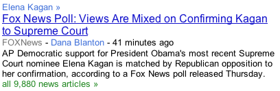
Really? There are 9,880 news articles discussing a Fox News poll? Where the old layout made clear, from the variance among revealed headlines, what the central subject matter of any particular pile of news stories was, the new appearance hides it.
(Note that the headline in the above example is no longer in bold, now reserved for only top stories, as shown in the previous example. This makes rapidly scanning the news significantly more difficult, an amateur blunder in this case almost not worth mentioning given all the other problems.)
[Google reverted to embolding headlines in early August 2010.]
Google apparently recognized the overall problem, because they added an extra label called a Topic Link for the entire pile just above the article:
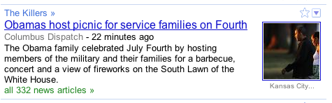
Unfortunately, the labels often have little to do with the pile. The above label, for example, appears to be suggesting that either the Obamas or our service families are killers. It turns out that a band by that name played at some point during the event.
If labels are not off the mark, they are often too general to be of much use. For example, two piles, in the same edition, were both labeled, “Microsoft.” One pertained to the death of the short-lived Kin phone and the other, the release of InstaLoad, Microsoft's remarkably simple (and clever) technology that allows users to insert batteries any old which way.
In the following illustration, not only is the label, “Mobile Industry,” so general as to be meaningless, the thrust of the pile is actually quite the opposite of the headline of the computer-selected article.
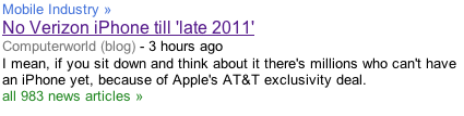
The pile is actually all about the prediction that the first Verizon iPhone will be released in early 2010, not late 2011. (Those reading this after the Verizon iPhone is released: It doesn't matter which prediction was right or wrong, the pile had to do with the 982 articles that predicted early 2010, not the one article that predicted late 2011.)
Now we get to those first paragraphs that show up under the headline. Given that the label is often meaningless and headlines are too often designed for cleverness, rather than information-transmission, the first paragraphs under New Coke News become vital to any attempt to discern the theme of a pile. Unfortunately, first paragraphs are often absent due to a weakness in Google's aggregation technology. Consider the following all-too-typical case:
Google has picked up the photo caption instead of the first paragraph. Now, the entire pile rests on the user's guess as to the relevance of a single headline.
This is where scrubbing comes in. In many cases, but not all, the user can force Google to reveal additional headlines. This is done by the user either hovering over each pile or clicking/touching on the 1st paragraph of the sample article. As frustrating and difficult as it may be, to really be able to grasp the significance or even the topic area of each pile, users pretty much have to scrub or click away at each and every article.
If the user chooses to scrub, by hovering for some period of time over each news pile, they may be in for heartbreak, because it doesn't always work. Sometimes hovering just won't trigger the pile won't open; sometimes the pile can't open because it really isn't a pile, it's just an isolated article. The safe bet is to just click and click and click. Unfortunately, this just piles on the very kind of repetitive stress that can lead to injury.
Touch screen users, of course, can't hover, so they must touch, touch, touch, touch, touch, touch, touch to open the piles up enough to gain effective context.
I have no criticism of Google's inability to select effective pile labels or to differentiate between a first paragraph and a photo caption. It would be nice if their computers could do a better job, but, with today's algorithms/technology, they can't. My argument is with designers that deny those limitations and design as though they don't exist.
[Local news was really useless when New Coke News was first released. It consisted of just three linked headlines. It has been partially returned to its original state, but, lacking 1st paragraphs and, often, additional links, still is far less useful than a custom section of your own construction.]
Local news now consists of three disembodied headlines. There are no 1st paragraphs and no alternate headlines In only some cases are there “all 14 news articles” links because many items are not piles at all. Just isolated articles. If you want local news, you now have to set up your own custom section using some kind of keywording that will trick Google into giving you the range of news you want.
There were a few things that actually need to be fixed in the old layout. One prime example: For mobile-phone touch users, it used to be that you could double-touch anything in a pile and the column would neatly fill the width of the display. Typically, users would double-touch the first-paragraph text since it was devoid of links.
Around a year ago, Google made a change that they apparently never realized was making life difficult for their users since apparently no one at Google uses mobile devices. Suddenly, the only way you could double-touch an pile to get it to fill out the screen properly was to double-touch the list of alternate news sources, all of which happen to be links. Frequently, this led to the browser incorrectly interpreting the double touch as a single touch, causing it to launch the particular link you happened to hit.
New Coke News did even that one better: There's now there's nothing you can double-touch that will make a pile neatly fill out the screen, making New Coke News even more unpleasant.
"Fast Flip" first appeared as a band across the bottom of the screen with what appeared to be several screen captures of the home pages of various websites, all carefully cropped in such a way that the most interesting information was hidden from view. It was a sort of a ten-o'clock teaser for the “News at 11.” Clicking on the picture of the website gave you the same screen except blown up, still with the information you now desperately desired hidden from view. You had to click yet again to get to the actual site and find the information you had been cajoled into seeking.
Fast Flip then shrank from several front pages down to only a single front-page image and was shoved into the useless-material column on the right. The user was expected to scroll the widget sideways, using a large pair of chevrons, to see even a second image. Clicking one of the images still didn't open it; it just took you to the dedicated Fast Flip page. If you wanted to open the article, you still had to click the now-blown-up screen-shot on that second page.
There was an upside to users having to go to the dedicated Fast Flip page: Having a giant, dedicated Fast Flip page gave Google the opportunity to show all the articles at once without any horizontal scrolling and minimal, if any, vertical scrolling!
Yeah, they had the opportunity, but they didn't take it. Instead, they showed one single shot at a time, expecting that users, having all the time in the world, would page through shot after shot of stuff they cared nothing about, hoping desperately for something of interest to pop up. This was an action that, I pointed out at the time, users were not going to do. I hoped these publications were not paying for any of this because, unless yours was the first article, the one that appeared on the actual News home page, few people would likely ever look at it."
[Fast Flip died a slow death about a year or so after I first published this article.]
Google's PR department is sending out all kinds of propaganda that the new, new Google News is highly customizable. It is anything but. If it were, most people I've seen discussing the change would turn off 100% of all the fluff and disjointed material in the right column. Then, they would elect to have their real news in a true two-column layout for rapid scanning. Then, they would turn off the hiding and showing of alternate articles & publications. Then, they would set the number of articles appearing in each section. Absolutely none of the above can be carried out in New Coke News.
In versions of Google News from the recent past, Google forced me to look at three articles in Spotlight. Today, I'm presented with 19 articles. I can limit or turn off National News, but I have no power to turn off Spotlight, now an extended, rag-tag jumble of headlines like, “Surely it's 30 (Don't call me Shirley!),” “The Bailout Tax,” and, of universal interest, per Google's computers, “A Dream Home in Palos Verdes Estates Deferred.” Deferred? Surely not!
Given a little context, like first-paragraph text, you might even find some of the above articles of interest. Sorry, Spotlight consists of nothing but disembodied headlines. You can scrub and click all you want and all you're going to get without clicking through to each and every article is, “Surely it's 30 (Don't call me Shirley!).”
This kind of capricious forcing of unwanted features occurs from one end of the page to the other. They are running scores right now for World Cup Soccer. Since the US was eliminated, I don't care anymore. I want that room for stuff that I do care about, but I have no control over it. Even eliminating the Sports section entirely had no effect over their jamming this score box down my throat. Same for local weather, “Most Popular” news, etc. It should be customizable if Google cares at all about their users. If millions of people eliminate it or limit the article count, that's good feedback that there's something about that feature that's broken for a lot of people.
By studying the feedback that Google received in their Help Forum over the last several months, I was able to compile a list of what features large numbers of people concluded really suck. That list is identical to the list of features that cannot be removed through customization. It would appear that the people behind this failed design knew perfectly well from their earlier studies what features people were going to hate, then elected to shove them all down our throats anyway in hopes we'd eventually get used to them.
It's one thing to just push a product out the door without any testing, only to be faced with the sudden realization that something went terribly, terribly wrong. It's quite another to discover that something has gone terribly, terribly wrong, but you're a giant corporation now, you have the power, and you just don't give a damn, so you ship it anyway.
Google has replaced most direct control over customization with indirection. Whereas before, we were thought mature enough to decide how many articles in each section we might enjoy, Google now wants to decide that for us, adopting Apple's infantilization philosophy in their attempt. Instead of direct action, we tell “Daddy” (Google) how often we read articles in each section, and then “Daddy” decides how many articles to show us.
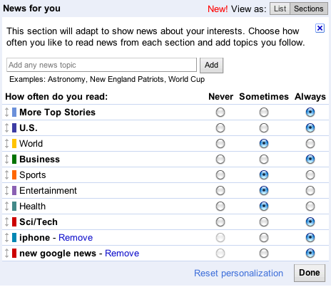
If Google wants to provide a mechanism dumbed-down to the point where they can cater to the people on the airplane that actually don't know how to buckle a seat belt, I'm all for it, but don't force the rest of us to let "Daddy" decide how many articles we want to read. We want and need a direct mechanism for article count. This new scheme is both insulting and injurious: Google is treating us like children and wasting our time in presenting more articles in many cases than we might wish.
Google did retain a facility for users to override Google's original wild guess at how many articles the user might want by adding an "More [section name] stories" link at the bottom of each section. However, adding injury to insult, the function, at least as released, doesn't even work properly, sometimes showing more articles, sometimes showing less, depending on what platform and browser you happen to be using. Apparently, they never bothered to send it to QA. What's more, you can't specify how many more stories you might want; Google will decide that for you. And may or may not remember the next time you refresh the screen.
It's not clear to me, at least, what other forms of personalizations take place. Google informs us we should be logged into Google News at all times so they can accurately track us. This is a wretchedly bad idea. Google is currently in the process of trying to roll over for the Chinese communist government while appearing not to. One must suspect they'd do the same thing for our government. It is a supremely bad idea for the citizens of a democracy to enable anyone, public or private, to track all the articles they might click. It's made worse by the fact that Google does not track whether you a) actually read the article and b) whether you agree with it or not. Someone intercepting or otherwise obtaining their incomplete data could through ignorance or venality draw conclusions about you and your belief system that are quite opposite the reality.
Under the most benign circumstances, it sounds as though Google might begin conforming the breadth of articles served to me by virtue of what I click on. This will cause my world to slowly and increasingly collapse inward as more and more information that I should at least be aware of through headlines disappears. The strength of Google News has always been the breadth of information, the power of a thousand publications displayed on a single screen. Nothing should pull back from that.
The United States is going through a period of deep political turmoil. I worked in politics in the '60s, at the height of the civil rights and anti-war movements. I understand radicalism and how it comes about because I witnessed it first-hand in talking to and observing the activities of people on both sides of the political spectrum: You start hanging around with like-minded people, you start listening to only like-minded voices, and, through that process, you start drifting further and further toward a particular extreme. If you cut yourself off enough from the mainstream, you can come to believe some pretty silly and potentially dangerous stuff.
It used to be fairly difficult to get yourself into this predicament. You had to turn off the TV. You had to stop reading the mainstream newspapers. You had to subscribe to special publications that would arrive in the mail in plain brown wrappers, magazines that fed you only the “truths” you wanted to hear.
Then came cable TV and, with it, both on the left and right, arose propaganda outlets disguised as news organizations. The world wide web followed, and all of a sudden, those earlier print publications that used to live in the shadows, depending on private mailing lists and word-of-mouth, became discoverable by and open to everyone. It became easier and easier for people to live in a bubble, gathering “truth” only from those who think exactly the way they do.
Google News has been a powerful counterforce to this polarization. By dispassionately selecting news from every possible source, it has presented so many points of view that readers are all but certain to gain a sense of the truth.
The United States of America has the oldest government in the world. Let that sink in for a minute. Every other country on the face of the planet has had a fundamental shift in their governmental makeup either due to war, revolution, or peaceful transition, as happened in England with the move from monarchy to democracy. We've had our troubles—the Civil War springs to mind—but for most of our history, American voters have all held to a common set of facts as true. Opinions drawn from those facts were in open to fierce debate, but not the facts themselves. That has changed and is continuing to change with the growing influence of radical elements both on Cable TV and the Internet.
Google News, presenting such an overwhelming number of differing voices, has allowed people to find and hold onto the center. It has been a force in stabilizing the United States of America.
No more. Google is now going to let you explicitly push away sources with which you disagree. Kill off Fox News or MSNBC, your choice. Vote for the Jerusalem Post or Al Jazeera, it's in your power. This is going to allow people to drift, to mirror the same sort of bubble they may have established for themselves via cable TV.
This a dangerous move. Google is no longer a small startup with an experimental news page. Millions of people go to Google News, and they all come to accept the reality of certain objective facts proven through so many competing sources. For example, everyone now knows that BP unleashed a huge oil spill in the Gulf of Mexico. The Republicans say it was all Obama's fault for having corrupt regulators. The Democrats are split. Some say it was all BPs fault, the rest say it was George Bush's fault for encouraging lax regulation in the first place. The correct answer is all three, but that's not what people who have knocked out the voices they do not wish to hear may conclude under New Coke News.
Instead, as users choose their political camp and dampen the voices of the opposition, what they should properly perceive as differing opinion and spin (aka, propaganda) will appear to line up as fact, never challenged by the opposing voices they have now stilled. These users will fail to recognize, as they take action to progressively knock out more and more voices, that their perceived truth is becoming more and more deeply colored.
Of all the new Google “features,” this is the only one I find most personally attractive. I, of course, see myself as so highly enlightened, so self-aware, than I could knock out the many publications I suspect of being biased without risking my sense of the truth. That makes me both wrong and pretty average.
Customizing sources is a very seductive feature. But consider this, if nothing else: It's those very propaganda outlets you disagree with that you need to keep an eye on the most, because, if they are truly propagandists, they are the biggest threat to our democracy. Then consider that, as you carve away on the left or the right with your customization, that you are moving your perceived center and, with it, yourself. You are inching toward a bubble.
Google appears to have some sensitivity to this issue. Through customization, you can tell them you don't like a series of publications, but they promise only to push them further into the background, rather than eliminating them altogether. You can get them to pull other publications forward into the spotlight, but not to the exclusion of all other sources. Maybe this power is limited enough in effect, maybe it isn't. I can only hope that they have put a lot more care and effort into this feature, so vital to the future of our democracy, than they have the rest of this dismal disaster.
Join my intensive (and fun!) lecture/ workshop course. Sign up now!Interaction Design course: Go from zero to interaction designer in just three days. User Experience Conference Website There's more than my course at an NN/g conference. You'll find a breadth of other specialized courses and networking opportunities that will put you and your company at the leading edge of the design curve. |
|
|
Have a comment about this article? Please start or join a discussion on your favorite forum. Errors, etc., please contact me.
Previous AskTog Columns >
|
Don't miss the next action-packed column! Receive a brief notice when new columns are posted by sending a blank email to asktoglist-subscribe@yahoogroups.com. |
| Contact Us: Bruce Tognazzini Copyright Bruce Tognazzini. All Rights Reserved |