 |
||||||||||
|
||||||||||
AskTog, December 2011
Browse vs. Search: Which Deserves to Go?
Hi Bruce,
Debating with a friend of mine why on earth we seem to want to browse or scroll long lists to find something when typing into a search box is so much more efficient.
Why does Apple give us list view as the starting point in Contacts (iPhone), not a big fat search box? In Lion and iOS the quickest way to find an app is to hit the Spotlight Search and start typing, yet they give us massive lists to browse?
Is it to do with spacial memory—we remember where things are?
Even if it is intuitive, it's inefficient once a search method is learned (easy) so should we build interfaces that support the lazy inefficient approach or should we steer users directly to a search box?
Your thoughts?
Craig Saunders
Join my intensive (and fun!) lecture/ workshop course. Sign up now!Interaction Design course: Go from zero to interaction designer in just three days. User Experience Conference Website There's more than my course at an NN/g conference. You'll find a breadth of other specialized courses and networking opportunities that will put you and your company at the leading edge of the design curve. |
|
|
As it turns out, Apple knows something Craig doesn't, but, what's more important, Craig knows something that Apple doesn't, or, at least, that Apple has forgotten. And Apple's amnesia is why I found Craig's letter important.
Who’s talking?Bruce Tognazzini was hired at Apple by Steve Jobs and Jef Raskin in 1978, where he remained for 14 years, founding the Apple Human Interface Group. He remains a major Apple fan, which is why, when Apple could do better, he feels compelled to talk about it. |
I'm going to offer Craig a redesign of Contacts, but first, I need to address three assumptions in Craig's email, beginning with the big one:
Assumption One: Search is easy to learn and more efficient than Browse.
Reality: Sometimes true; often not. While every engineer may find Search easy and efficient, that is not the experience of most people under many conditions, including those encountered by the users of the systems Craig has referenced—Contacts, iOS, and Lion. Learning to type into a box is easy. Memorizing the names of perhaps several hundred apps so you know what to type into the box, not so easy. Unless you are an engineer.
For all our bluster about how special we in high tech are, we really tend to think of ourselves as average—average intelligence, average likes and dislikes, average knowledge. We are none of the above. In fact, only one person in the entire world is average, and we don't know who that person is. Certainly, that person is neither an engineer, graphic designer, or behavioral (HCI) designer. The odds of you, Gentle Reader, being that one average person are 1 in whatever that clock below currently reads:
75% of the 2.5+ million people in the Western world who have taken the Myers-Briggs Type Indicator Test prove out to be Sensories, connected directly with the physical world, the here and now (Myers) Programmers in current high tech tend to be at least 75% Intuitive based on my and other's studies (Tog On Interface). Designers in high tech have tested at 75% and higher. Our professions, both engineering and design, self-select for people who have the ability to generate and decode complex mental models. Many of these same people have well above average abilities at rote memorization. Many get pleasure from closing their eyes wandering through the innards of their computer or their design model without reference to any physical (visual, aural, etc.) manifestation. As I so eloquently put it in Tog on Software Design when discussing engineers in particular:
We are not “normal.” Engineers are bright, intuitive, and have superior memories. We are also, as Marty Graham reported in “Nerds get revenge—but they pay a price,” overwhelmingly male (Graham). Then there’s the matter of our arrested development: According to some local shrink Graham dug up, that’s why we are so fascinated with remote controlled toys and inflatable dinosaurs. I always thought it was because they were really fun.
Or, as William Hudson expressed it:
...highly gifted scientists and engineers with AS are found to have strong systemizing behavior but at considerable expense to empathizing. They are recognized as having abnormal social and communicative development as well as a very narrow set of interests, among other traits (Hudson).
Engineers with reduced empathizing skills, Hudson's paper continues, design for themselves. Left unchecked, they can cause great mischief by designing software no one by they can use. Quick to code and easy to learn, but only if you were the one who coded it. Steve Wozniak + Steve Jobs + Mike Markuula invented the Apple II, the first "personal computer." (Traffic was responsible for Apple being first. The Commodore PET arrived at the West Coast Computer Faire 1.5 hours later, making it the second "personal computer.)
The Apple was familiar-looking and approachable. Woz, the engineering genius behind it, later developed the CL 9, the first programmable universal remote control. It featured the keys 0 through F, labelled with the standard Hexadecimal notation so familiar to everyone born with 16 fingers. It enabled you to capture and command 256 different codes spread across 16 invisible "pages." You just had to memorize the page and position of all 256 of those codes and you could control everything! Woz and about three other people were able to make excellent use of the resulting product. Engineering, even genius engineering (and Woz was and is second to none), must be balanced with equally talented design.
Graphic designers, left unchecked and unschooled, are likely to aim for maximum visual simplicity at the expense of both learnability and usability. Such interfaces require users to discover new capabilities by clicking around and seeing what happens. Users don't do that. In the most extreme cases, functionality desperately needed by the majority of users may actually be removed from products in the effort to generate visual simplicity. Lion's Address Book is a case in point. Apple's graphic designers have succeeded in creating a beautiful book while simultaneously tearing out critical functionality and installing a design model that is utterly bizarre. (See: http://arstechnica.com/apple/reviews/2011/07/mac-os-x-10-7.ars/5.)
Both these professions need to be offset by a third: Behavioral designers, a. k. a., human-computer interaction (HCI) designers. (It could be expected that HCI designers would also run amok without engineers and graphic designers to moderate their behavior. So far, HCI designers have never experienced that situation.)
The three professions, working together, with a healthy tension among them, produce good software and good products. That balance of power is critical to success.
Then, there are the users. They are different from us. Users must be assumed to favor full visualization, with 75% feeling significant discomfort with abstraction (Myers, Tog on Interface). This majority has spacial and motor memories that tend to be good, while their ability to rote-memorize and to form complex mental models may be limited, and, in any case, they find those particular tasks unpleasant.
All this in no way should imply we shouldn't offer Search. There are conditions under which it becomes essential. There are millions of people like Craig who are efficient with it and enjoy using it. It does mean we should not assume that because we high-techies are efficient and comfortable with Search and other abstract interactions that everyone else shares our skill and our joy.
Assumption Two: People have many contacts in their iPhone Contacts list.
Reality: Most don't. People in our professions may very well have dozens of contacts in their address books, built up over years of using computers and palm-top devices even before we all transferred our list and our lives to the iPhone or other smart phones. That is not true of most users. Why? For one thing, most users have been conditioned to losing their contacts every time they buy a new phone. (Yes, I know we kept our contacts, but think back to what we had to do to keep them.) These users have long since learned not to bother saving any but their most frequent contacts.
I've informally interviewed many iPhone owners who are not connected with tech nor tied into some kind of corporate address book. Only two of them had more than a dozen or so contacts. (More definitive statistics would be appreciated.) And among those with few contacts, to a person they had no desire to spend the time or effort to increase that number. Then, there are the new users, many of whom start with no contacts at all, adding one or two at a time as they go along. For both groups, browsing their short lists instead of entering a search is faster, and Apple is right in ensuring that Apple makes scrolling—browsing—as effective as possible.
Assumption Three: Apple must choose—great Browse or great Search.
Reality: Both can be great. I will present you with a design that not only fixes Search, but makes Browse better. But first, let's examine each separately.
Browse
Browsing is accomplished in Contacts using the Scroll interface.
Apple has done a pretty good job with their Scroll interface in Contacts. If the user has only 10 or 20 contacts, he or she can get to them very rapidly using simple swipes. Apple has expanded their scroll scheme for intermediate users, users who have up to around 50 or 60 contacts. A user can touch the alphabet list on the right side of the screen, instead of just stabbing at the letter of choice, then slide her finger up and down, jumping the list from letter to letter until she reaches the desired letter group. With less than a screenful under most or all letters, zeroing in on the correct contact then becomes a simple touch. While the alphabet column appears quite thin, making it appear to be a difficult Fitts' Law target, the actual target area is much larger and, once you've actually touched the alphabet column, the target area expands to fill the entire screen, eliminating the chance of your losing the target.
Scroll does have a few problems, however. The first is a result of Apple's completely reversal of the philosophy that resulted in the Mac: Instead of working to make everything visible to the user, Apple's industrial and graphic designers, now fully in command, are doing just the opposite: Apparently bereft of even the barest knowledge of behavioral (HCI) design, they have busied themselves hiding everything they can, increasing visual simplicity at the expense of actual simplicity. Then, they pretend both to themselves and to us that the only instruction you'll ever need for an iPad is, "Turn it on." iPad users are left to stumble around, trying to find the things they need to get their work done, things so carefully hidden that without a friend to help them, they are unlikely to ever find them.
Case in point: At some point in the past, perhaps the distant past, Apple added the capability to jump from letter group to letter group by holding down on the letter column, rather than just stabbing at your letter of choice (and usually missing). After four years of using iDevices, during the course of writing this column, I accidentally held down for a second on an alpha character, causing the slide bar to appear. I never knew before that moment that hold-and-slide even existed in Contacts. Principle: If a capability is not visible and the developer does not teach that capability, it may as well not exist.
Another Scroll problem: Touching the top of the screen (another hidden feature) to make the Search box appear, also transports the user all the way back to "AAAA Acme Corporation" or whatever contact leads off your Contacts list. Apple has run Scroll and Search together by putting the search box actually in the list itself. This reduces the usability of both strategies. It should have never happened, but it can be fixed, and we will do just that shortly.
Finally, it is right and proper that they have made the alphabet-column target area quite large once you have touched and held it. That avoids the problem of our giant fingers wandering too far toward the left while scrolling, slamming the list shut. However, they have overdone it: Historically, in GUIs, pulling away from such a target far enough acts to cancel the pending action, leaving you exactly as you were before you started. Purposely sliding one's finger all the way over to the left third of the display (exact percentage subject, of course, to user testing) should snap the alphabet-column highlight off and return the user to precisely where they were in the list before scrolling. It doesn't, and that needs to be addressed. Principle: It should be as easy or easier to Undo as it is to Do.
Apple has, across their product line, expanded the range of users who can make use of their browse solutions, now stretching all the way from brand-new users to people who have owned their devices for as many as six months! As mentioned, in Contacts, one can now effectively browse 50 or 60 contacts, instead of 10 or 20. In OS X using the Dock, one can effectively browse 30 or 40 documents, instead of 3 or 4. Gee wizz, that's just swell, but I have more that 5000 applications, folders, and documents, and I would like to browse them all quickly and effectively.
When it comes to supporting serious Mac users, Apple right now is like the Honey Badger: Apple don't care, so I'm fresh out of luck.
Unless, of course, I use Search.
Many people, myself included, depend on spacial memory, as Craig suggested, as well as motor memory, fed off kinesthesia. Fortunately, there are better browsing tools for the Mac. I use the shareware program, DragThing, an application that gives me access with a single sweep of the mouse to more than 500 of my most-used files, including applications, folders, and documents.
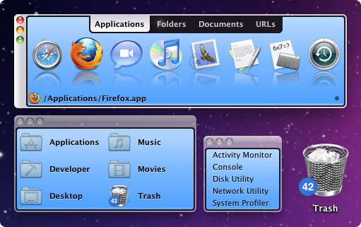
DragThing also lets me organize those 500+ files, so even when I have no memory of an application's or document's name at all, I can still find it fast. (Between the iOS and Mac worlds, I have in excess of 400 apps alone. Some, particularly utilities, I may need only every couple of years. I can't even come close to remembering all of their exact names.) It also lets me put the trash can on the desktop, where I want it.
Unlike the Mac, the iOS environment is locked down tight. When a developer decides to lock out everyone else from their private sand box, they need to provide robust solutions that support not only new users, but those of us who have been here from the beginning, learning, using, and expanding our holdings and our needs. Apple, right now, is failing to do so. I in no way fault Apple for concentrating on selling products. I do fault them for failing to support users as the users move from beginner to veteran. It doesn't help Apple's sales when their most important sales force, we experienced users, are constantly frustrated by Apple's failure to keep up with or even show the slightest concern for our expanding needs.
Search
Craig, there are two kinds of people in the world: Searchers and Browsers. Searchers can browse when required, and Browsers can search when required. Neither is drawn to the other.
While it has been Craig's and his debating partner's personal experience that in Lion and iOS, Search is "the quickest way to find an app," that's only true if you can remember the exact name of the app. I can't. Many, probably most, users can't. To some extent, this is the fault of Apple's faulty search. This year, Apple has finally started improving a search mechanism that has been an embarrassment for 20 years. Still, in Lion, unless you know exactly what you're looking for and how to spell it, you are fresh out of luck. A small group of people, including almost all programmers, have extraordinary memories and can remember the exact name of all their applications/apps/documents, etc. The rest of us have to guess and guess and guess.
Apple's Spotlight search for iOS until recently couldn't even find the real name of the app, as it was sold in iTunes, rather than the cryptic shortened name displayed on Springboard. The slightest error in spelling still results in zero hits, rather than a friendly Google-like "Did you mean...". And when you do find the app using Spotlight, it doesn't tell you where it is! So you either have to paw through all your apps (in my case, more than 250) or consign yourself to remembering the exact name of the app from now on. I stopped buying apps because of this. I love buying apps, but, between the toy folders that reject nesting and a search that is so deficient, I can no longer keep track of the apps I've already purchased.
In address book, I'm still fresh out of luck if I want to find someone when what I remember is their area code, street name, zip code, or anything other than their name, and I'm required to remember the exact spelling of their name at that.
The Mail search for iOS is hopeless. You have to specify which folder the message is in. If I knew that, I probably could have just pawed through that particular folder and found it. Strangely, the Spotlight search at the Springboard level in the exact same iOS has no problem searching across all mail folders. Why should you have to know to avoid the built in search and, instead, leave Mail, go to the desktop, then to Spotlight, in order to look for an email? It makes no sense.
Apple needs to continue their very recent drive toward a respectable search if they expect users to actually embrace it.
Redesigning Contacts
Having the search box disappear when you begin to scroll down the list is, in itself, not a bad design choice given the tiny size of mobile phone screens. The problem with the current implementation is that it is hard to ever get that search box back. You have to touch a very thin target at the top of the screen, then touch a second time inside the search box to open up the type-in field. That's way too slow for what will, for many users, become the default search method, and it wrestles control away from the user by suddenly moving them from their position in the list all the way back up to AAA Cleaners at the top.
The Redesign
- The target area for the show-search-box button at the very top of the screen should extend at least halfway down into the title area, e. g., "All Contacts." I would try actually making the entire title area be the target, subject to usability testing. The current target is too small, resulting in people having to move slowly or hit repeatedly to acquire the target. Fitts' Law is not repealed for touch devices. In fact, Paul Fitts originally discovered the law when working on a true direct manipulation interface, not an indirect manipulation scheme as in mouse-driven interfaces. Principle: Fitts' Law, a. k. a. Fitts's Law: Small targets slow acquisition
- The now-invisible button's touch area should have a visible signifier, a. k. a. affordance, that will at least lead notify users that touching this area will cause some action to occur, if not fully informing them of what action will occur. Principle: Visibility. If a control can't been seen, heard, touched, or felt, it doesn't exist.
- The search box should be an overlay, rather than the first item in the address list. It should be approximately twice the current height, conforming it to Craig's "big fat" suggestion. He's right. As with the touch area to summon the Search box, the Search box itself needs to be quickly and easily hit. Size matters. FItts' Law.
When the user enters the Contacts list for the first time, the screen would appear very much as it does now, with a search box at the top followed by the first item on the list. Starting to scroll would, as now, cause the Search box to disappear, but, unlike now, the Search box would just snap off, rather than scrolling off the top of the screen. This becomes an important distinction when you need to summon it again.
Just as now, touching the show-search-box will bring back the Search box, but not by scrolling the list to the top. Instead, the list stays just where it is. That way, if the user hit the touch area by accident, they don't have to try to find their place in the list again. Principle: Undo should be as easy as Do. Principle: Stability.
The user could also launch a new search from within a contact, instead of having to return to the list. The Search box and the shrinking list of possibilities that results as one types now would overlay the current contact, again enabling easy undo. If the user types enough to have only one possible hit, then presses the confirm button ("Search") on the virtual keyboard, the user should be taken to that contact directly and not have to select that which is already selected.
With these changes, both Browse and Search are improved, making everyone happy.
And that, after all, is the goal of HCI.
A Reader Writes...
In the "Browse vs. Search" articles you refer to the "Meyers-Briggs Type Indicator Test." The first name in that pair is actually spelled without the first -e-, that is, it's "Myers." You can see it that latter way in any standard reference or even in your references list at the end of the article!
Thanks for your always interesting columns.
- Mitchell Marks
My Response
(Why am I always coming up with examples based on my own embarrassing personal failures? Why do I ask so many rhetorical questions?)
Cites
• Graham, Marty (1992). “Nerds get revenge—but they pay a price,” The San Francisco Examiner, August 30, 1992.
• Hudson, William, 2009, Reduced Empathizing Skills Increase Challenges for User-Centered Design, CHI 2009 Conference, Boston and British HCI Group Conference, Cambridge
• Myers, Isabel Briggs and McCaulley, Mary H. (1985). Manual: A. Consulting Psychologists Press, Palo Alto, CA.
• Norman, Donald, “Some Observations on Mental Models,” in Gentner, Dedre & Stevens, Mental Models, Lawrence Erlbaum Associates, Hillsdale, N.J.
• Tognazzini, Bruce “Tog.” (1992),Tog on Interface. Addison-Wesley, Reading, MA.
• Tognazzini, Bruce “Tog.” (1996),Tog on Software Design. Addison-Wesley, Reading, MA.
Have a comment about this article? Please start or join a discussion on your favorite forum, Slashdot suggested. Errors, etc., please contact me.
Previous AskTog Columns >
|
Don't miss the next action-packed column! Receive a brief notice when new columns are posted by sending a blank email to asktoglist-subscribe@yahoogroups.com. |
| Contact Us: Bruce Tognazzini Copyright Bruce Tognazzini. All Rights Reserved |